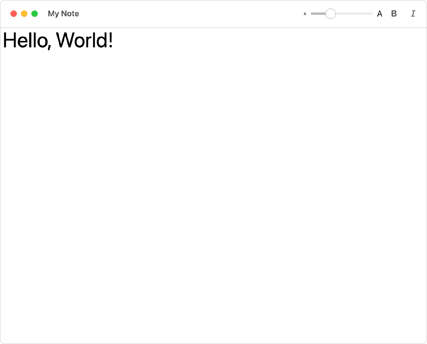
The items representing the content of the toolbar.
toolbar(content:)
Availability 有効性
- iOS 14.0+
- iPadOS 14.0+
- macOS 11.0+
- Mac Catalyst 14.0+
- tvOS 14.0+
- watchOS 7.0+
Technology
- Swift
UI
Declaration 宣言
func toolbar<Content>(content: () -> Content) -> some View where Content : ToolbarContent
Parameters パラメータ
content
Discussion 議論
Use this method to populate a toolbar with a collection of views that you provide to a toolbar view builder.
The toolbar modifier expects a collection of toolbar items which you can provide either by supplying a collection of views with each view wrapped in a Toolbar, or by providing a collection of views as a Toolbar. The example below uses a collection of Toolbar views to create a macOS toolbar that supports text editing features:
struct StructToolbarItemGroupView: View {
private var text = ""
private var bold = false
private var italic = false
private var fontSize = 12.0
var displayFont: Font {
let font = Font.system(size: CGFloat(fontSize),
weight: bold == true ? .bold : .regular)
return italic == true ? font.italic() : font
}
var body: some View {
VStack {
TextEditor(text: $text)
.font(displayFont)
.toolbar {
ToolbarItemGroup {
Slider(
value: $fontSize,
in: 8...120,
minimumValueLabel:
Text("A").font(.system(size: 8)),
maximumValueLabel:
Text("A").font(.system(size: 16))
) {
Text("Font Size (\(Int(fontSize)))")
}
.frame(width: 150)
Toggle(isOn: $bold) {
Image(systemName: "bold")
}
Toggle(isOn: $italic) {
Image(systemName: "italic")
}
}
}
}
.navigationTitle("My Note")
}
}
Although it’s not mandatory, wrapping a related group of toolbar items together in a Toolbar provides a one-to-one mapping between controls and toolbar items which results in the correct layout and spacing on each platform. For design guidance on toolbars for macOS apps, see macOS Human Interface Guidelines > Toolbars. For design guidance on toolbars for iOS apps, see iOS Human Interface Guidelines > Toolbars.