init(content: () -> Content)Overview 概要
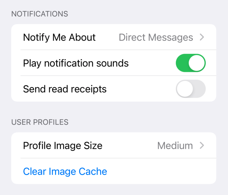
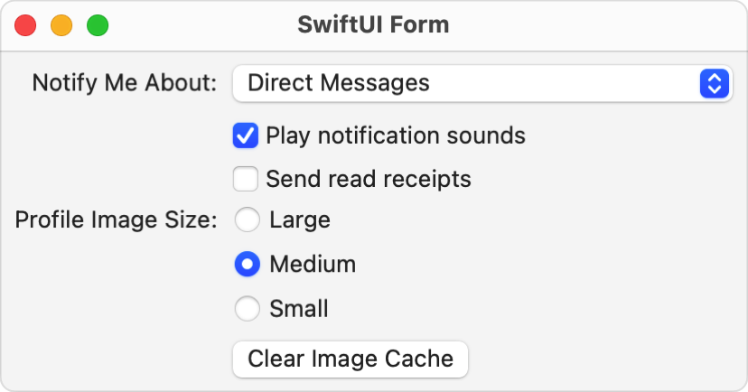
SwiftUI applies platform-appropriate styling to views contained inside a form, to group them together. Form-specific styling applies to things like buttons, toggles, labels, lists, and more. Keep in mind that these stylings may be platform-specific. For example, forms apppear as grouped lists on iOS, and as aligned vertical stacks on macOS.
The following example shows a simple data entry form on iOS, grouped into two sections. The supporting types (Notify and Profile) and state variables (notify, profile, play, and send) are omitted for simplicity.
var body: some View {
    NavigationView {
        Form {
            Section(header: Text("Notifications")) {
                Picker("Notify Me About", selection: $notifyMeAbout) {
                    Text("Direct Messages").tag(NotifyMeAboutType.directMessages)
                    Text("Mentions").tag(NotifyMeAboutType.mentions)
                    Text("Anything").tag(NotifyMeAboutType.anything)
                }
                Toggle("Play notification sounds", isOn: $playNotificationSounds)
                Toggle("Send read receipts", isOn: $sendReadReceipts)
            }
            Section(header: Text("User Profiles")) {
                Picker("Profile Image Size", selection: $profileImageSize) {
                    Text("Large").tag(ProfileImageSize.large)
                    Text("Medium").tag(ProfileImageSize.medium)
                    Text("Small").tag(ProfileImageSize.small)
                }
                Button("Clear Image Cache") {}
            }
        }
    }
}
On macOS, a similar form renders as a vertical stack. To adhere to macOS platform conventions, this version doesn’t use sections, and uses colons at the end of its labels. It also sets the picker to use the inline style, which produces radio buttons on macOS.
var body: some View {
    Spacer()
    HStack {
        Spacer()
        Form {
            Picker("Notify Me About:", selection: $notifyMeAbout) {
                Text("Direct Messages").tag(NotifyMeAboutType.directMessages)
                Text("Mentions").tag(NotifyMeAboutType.mentions)
                Text("Anything").tag(NotifyMeAboutType.anything)
            }
            Toggle("Play notification sounds", isOn: $playNotificationSounds)
            Toggle("Send read receipts", isOn: $sendReadReceipts)


            Picker("Profile Image Size:", selection: $profileImageSize) {
                Text("Large").tag(ProfileImageSize.large)
                Text("Medium").tag(ProfileImageSize.medium)
                Text("Small").tag(ProfileImageSize.small)
            }
            .pickerStyle(.inline)


            Button("Clear Image Cache") {}
        }
        Spacer()
    }
    Spacer()
}