Discussion 議論
Use horizontal to configure the visual layout of radio buttons in a Picker so that the radio buttons are arranged horizontally in the view.
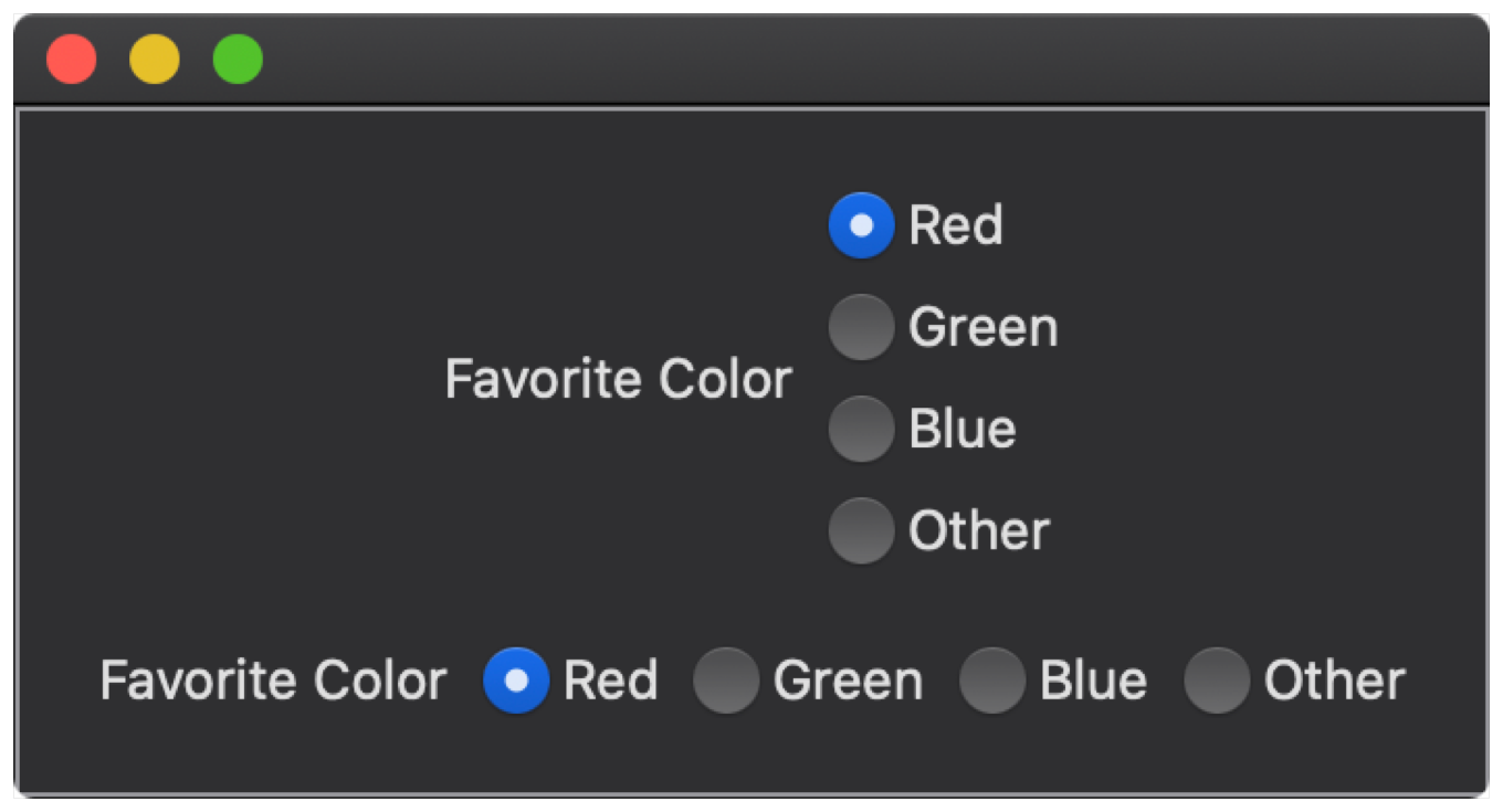
The example below shows two Picker controls configured as radio button groups; the first group shows the default vertical layout; the second group shows the effect of horizontal which renders the radio buttons horizontally.
struct HorizontalRadioGroupLayout: View {
private var selected = 1
var body: some View {
VStack(spacing: 20) {
Picker(selection: $selected, label: Text("Favorite Color")) {
Text("Red").tag(1)
Text("Green").tag(2)
Text("Blue").tag(3)
Text("Other").tag(4)
}
.pickerStyle(.radioGroup)
Picker(selection: $selected, label: Text("Favorite Color")) {
Text("Red").tag(1)
Text("Green").tag(2)
Text("Blue").tag(3)
Text("Other").tag(4)
}
.pickerStyle(.radioGroup)
.horizontalRadioGroupLayout()
}
.padding(20)
.border(Color.gray)
}
}