struct Alignmentstruct HorizontalAlignment struct VerticalAlignment protocol AlignmentID struct ViewDimensions Technology
Stacks place their child views to match their alignment, which defaults to center alignment. When you initialize the stack, you can specify an alignment for the stack to use that also applies to a stack’s child views. If you want to modify the placement of individual child views, use the alignment guide modifier to make adjustments that offset the view from the alignment the stack provides.
To align views across multiple stacks, see Aligning Views Across Stacks.
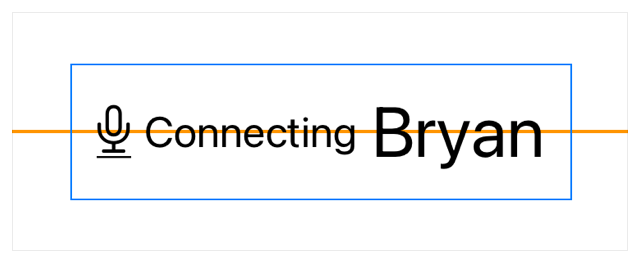
For an example of how SwiftUI applies default alignment to the views in an HStack, examine the following code used to provide a status view for a recording app. The HStack contains an image view for the icon and two text views with labels that use the font(_:) modifier to adjust the font size of the text.
HStack {
    Image("microphone")
    Text("Connecting")
        .font(.caption)
    Text("Bryan")
        .font(.title)
}
.padding()
.border(Color.blue, width: 1)
The orange reference line in the following figure shows the default alignment position of the views within the stack. The line functions as a visual reference for the purposes of this article.

You can align content within a stack based on guides provided by the alignments that the stack supports. The various kinds of stacks support the following alignments:
HStack uses the guides defined in Vertical.
VStack uses the guides defined in Horizontal.
ZStack uses the guides defined in Alignment, and a combination of Horizontal and Vertical.
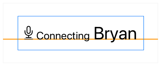
Use the alignment parameter when initializing a stack to define the alignment guide for the stack. The following example sets the alignment of the HStack to first, which aligns its child views to the baseline of the first text view (which contains the string “Connecting”):
HStack(alignment: .firstTextBaseline) {
    Image("microphone")
    Text("Connecting")
        .font(.caption)
    Text("Bryan")
        .font(.title)
}
.padding()
.border(Color.blue, width: 1)
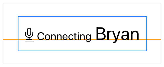
Custom images don’t provide a text baseline guide, so the bottom of the image aligns to the text view’s baseline. Adjust the alignment of the image using alignment to get the visual alignment you desire. The alignment guide’s closure provides an instance of View, the parameter context in this example — which you can use to return an offset value. The value looked up from context with bottom, provides an offset that aligns the bottom of the image adjusted by an offset to the baseline guide defined on the stack:
HStack(alignment: .firstTextBaseline) {
    Image("microphone")
        .alignmentGuide(.firstTextBaseline) { context in
            context[.bottom] - 0.12 * context.height
        }
    Text("Connecting")
        .font(.caption)
    Text("Bryan")
        .font(.title)
}
.padding()
.border(Color.blue, width: 1)
When you use an alignment guide modifier, make sure to specify an active alignment of the stack. Otherwise, SwiftUI doesn’t invoke the closure to offset the view. In the example above, the first input to the alignment guide matches the stack’s alignment, so the adjustment affects the placement of the image:

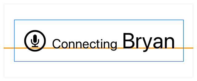
You can replace the microphone image with a similar icon from SF Symbols to simplify the view. The icons from SF Symbols use text baseline guides, which means they support whatever font styling you apply to the view.
HStack(alignment: .firstTextBaseline) {
    Image(systemName: "mic.circle")
        .font(.title)
    Text("Connecting")
        .font(.caption)
    Text("Bryan")
        .font(.title)
}
.padding()
.border(Color.blue, width: 1)
struct Alignmentstruct HorizontalAlignment struct VerticalAlignment protocol AlignmentID struct ViewDimensions