struct Fontstruct ScaledMetric enum Casestruct DateStyle Date.struct LineStyle StrikethroughStyleAttribute and UnderlineStyleAttribute .enum LegibilityWeight enum DynamicTypeSize struct RedactionReasons Technology
SwiftUI supports styling text views using the built-in fonts, and uses a system font by default. Rather than using a system-provided font, you can use custom fonts by including the font files in your Xcode project. To use a custom font, add the font file that contains your licensed font to your app, and then apply the font to a text view or set it as a default font within a container view. SwiftUI’s adaptive text display scales the font automtically using Dynamic Type.
Dynamic Type allows users to choose the size of textual content displayed onscreen. It helps users who need larger text for better readability and accommodates those who can read smaller text, allowing more information to appear onscreen.
To add the font files to your Xcode project:
In Xcode, select the Project navigator.
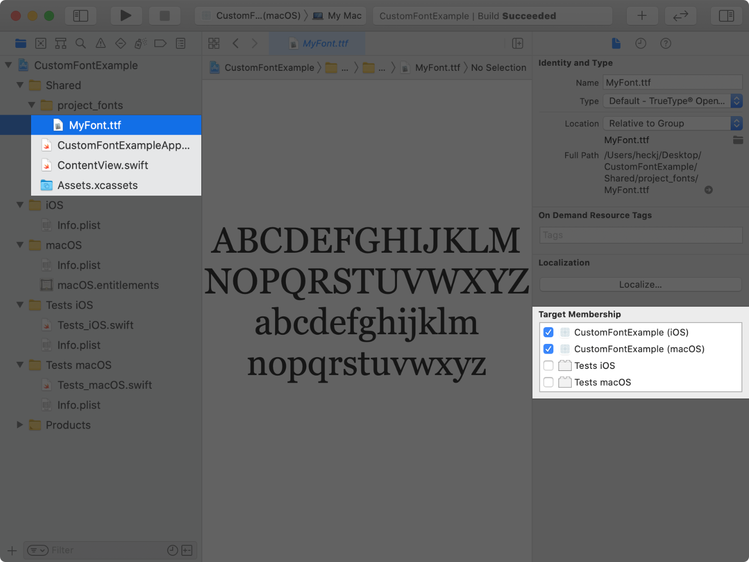
Drag your fonts from a Finder window into your project. This copies the fonts to your project.
Select the font or folder with the fonts, and verify that the files show their target membership checked for your app’s targets.

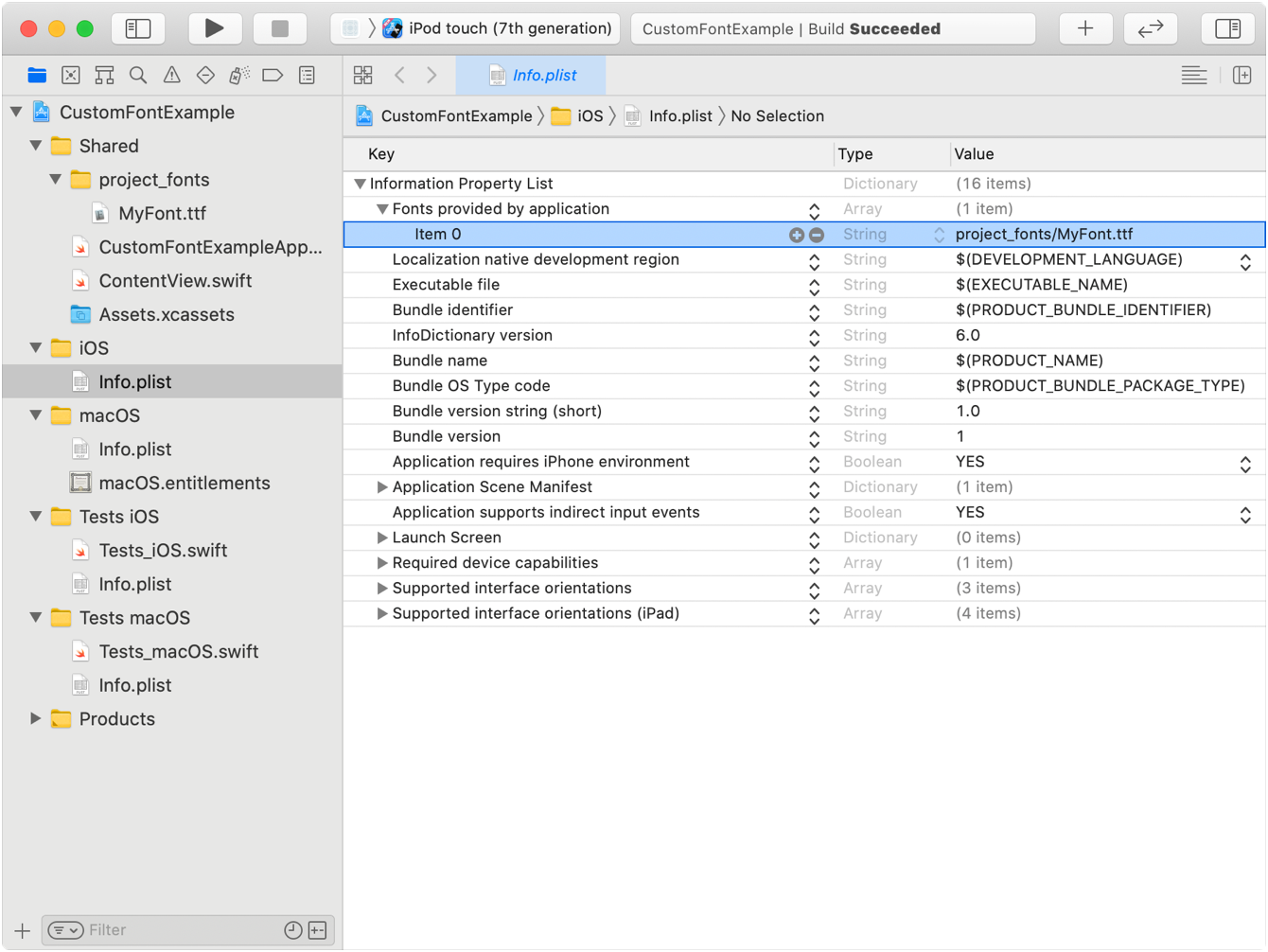
For iOS, watchOS, tvOS, or Mac Catalyst targets, add the UIApp key to your app’s Info file. For the key’s value, provide an array of strings containing the relative paths to any added font files. For a macOS app target, use the ATSApplication key in your target’s Info file, and provide the name of the folder that holds the fonts as the value for that key.
In the following example, the font file is inside the project directory, so you use project as the string value in the Info file.

Use the custom(_: method to retrieve an instance of your font and apply it to a text view with the font(_:) modifier. When retrieving the font with custom(_:, match the name of the font with the font’s PostScript name. You can find the postscript name of a font by opening it with the Font Book app and selecting the Font Info tab. If SwiftUI can’t retrieve and apply your font, it renders the text view with the default system font instead.
The following example applies the font My to a text view:
Text("Hello, world!")
    .font(Font.custom("MyFont", size: 18))
The font scales adaptively from the size provided to align with the default text style of body. Use the relative parameter to specify a text style to scale with other than the default of body. For example, to set the font size to 32 points and adaptively scale relative to the text style of title:
Text("Hello, world!")
    .font(Font.custom("MyFont", size: 32, relativeTo: .title))
SwiftUI doesn’t synthesize bold or italic styling for fonts. If the font supports weighted or italic variants, you can customize the typography of the text view by styling the font using the weight(_:) or italic() modifiers.
For design guidance on choosing fonts to enhance your app on your target platform, see the Human Interface Guidelines > Typography for iOS, macOS, watchOS, or tvOS.
The Scaled property wrapper on a view property provides a scaled value that changes automatically with accessibility settings. When working with adpatively sized fonts, you can scale the spacing between or around the text to improve the visual design with this property wrapper.
The following example uses @Scaled to scale the padding value surrounding a text view relative to the body text style, with a blue border added to identify the spacing that padding adds:
struct ContentView: View {
(relativeTo: .body) var scaledPadding: CGFloat = 10
var body: some View {
Text("The quick brown fox jumps over the lazy dog.")
.font(Font.custom("MyFont", size: 18))
.padding(scaledPadding)
.border(Color.blue)
}
}
struct ContentView_Previews: PreviewProvider {
static var previews: some View {
ContentView()
}
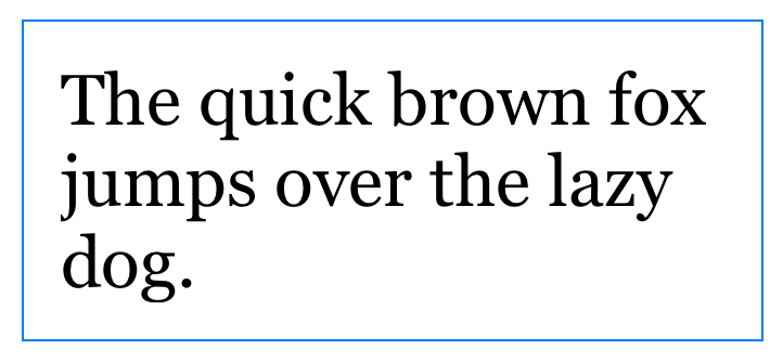
}The preview shows the following image without any accessibility settings turned on:

Use the environment(_: modifier to set the accessibility size category on the preview to Content:
struct ContentView_Previews: PreviewProvider {
    static var previews: some View {
        ContentView()
            .environment(\.sizeCategory, .accessibilityLarge)
    }
}
The preview then shows the following image that reflects the increased accessibility size and the scaled padding:

struct Fontstruct ScaledMetric enum Casestruct DateStyle Date.struct LineStyle StrikethroughStyleAttribute and UnderlineStyleAttribute .enum LegibilityWeight enum DynamicTypeSize struct RedactionReasons