Discussion 議論
Use this Toggle to let SwiftUI pick a suitable style for the current platform and context. Toggles use the automatic style by default, but you might need to set it explicitly using the toggle modifier to override another style in the environment. For example, you can request automatic styling for a toggle in an HStack that’s otherwise configured to use the button style:
HStack {
    Toggle(isOn: $isShuffling) {
        Label("Shuffle", systemImage: "shuffle")
    }
    Toggle(isOn: $isRepeating) {
        Label("Repeat", systemImage: "repeat")
    }


    Divider()


    Toggle("Enhance Sound", isOn: $isEnhanced)
        .toggleStyle(.automatic) // Set the style automatically here.
}
.toggleStyle(.button) // Use button style for toggles in the stack.
Platform Defaults
The automatic style produces an appearance that varies by platform, using the following styles in most contexts:
Platform |
Default style |
|---|---|
iOS, iPadOS |
|
macOS |
|
tvOS |
A tvOS-specific button style (see below) |
watchOS |
The default style for tvOS behaves like a button. However, unlike the button style that’s available in some other platforms, the tvOS toggle takes as much horizontal space as its parent offers, and displays both the toggle’s label and a text field that indicates the toggle’s state. You typically collect tvOS toggles into a List:
List {
    Toggle("Show Lyrics", isOn: $isShowingLyrics)
    Toggle("Shuffle", isOn: $isShuffling)
    Toggle("Repeat", isOn: $isRepeating)
}
Contextual Defaults
A toggle’s automatic appearance varies in certain contexts:
A toggle that appears as part of the content that you provide to one of the toolbar modifiers, like
toolbar(content:), uses thebuttonstyle by default.-
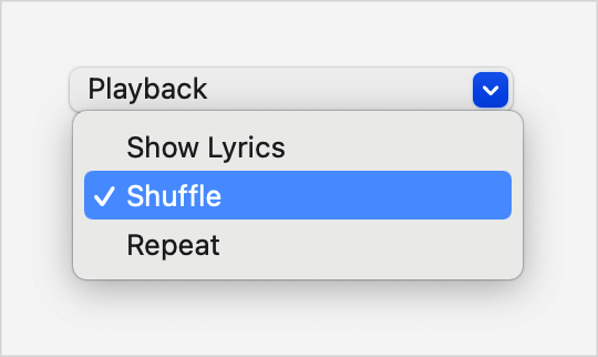
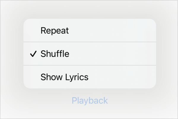
A toggle in a
Menuuses a style that you can’t create explicitly:Menu("Playback") { Toggle("Show Lyrics", isOn: $isShowingLyrics) Toggle("Shuffle", isOn: $isShuffling) Toggle("Repeat", isOn: $isRepeating) }SwiftUI shows the toggle’s label with a checkmark that appears only in the
onstate:Platform
Appearance
iOS, iPadOS
macOS