Structure

Gauge

A view that shows a value within a range. あるビュー、それはある値をある範囲内で示します。

Declaration 宣言

struct Gauge<Label, CurrentValueLabel, BoundsLabel, MarkedValueLabels> where Label : View, CurrentValueLabel : View, BoundsLabel : View, MarkedValueLabels : View

Overview 概要

A gauge is a view that shows a current level of a value in relation to a specified finite capacity, very much like a fuel gauge in an automobile. Gauge displays are configurable; they can show any combination of the gauge’s current value, the range the gauge can display, and a label describing the purpose of the gauge itself.

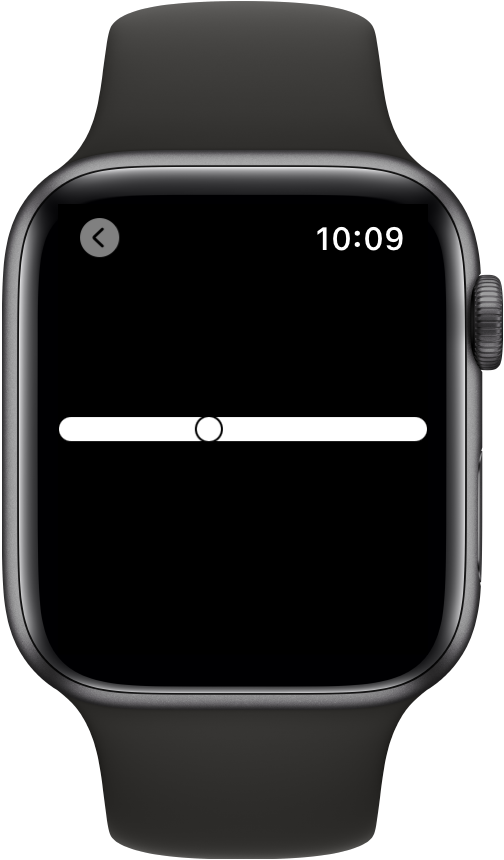
In its most basic form, a gauge displays a single value along the path of the gauge mapped into a range from 0 to 100 percent. The example below sets the gauge’s indicator to a position 40 percent along the gauge’s path:


struct SimpleGauge: View {
    @State private var batteryLevel = 0.4


    var body: some View {
        Gauge(value: batteryLevel) {
            Text("Battery Level")
        }
    }
}

A linear gauge displaying a current value set to 40 percent in a range of 0

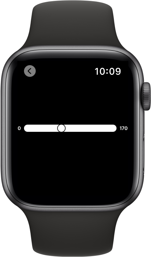
You can make a gauge more descriptive by describing its purpose, showing its current value and its start and end values. This example shows the gauge variant that accepts a range and adds labels using multiple trailing closures describing the current value and the minimum and maximum values of the gauge:


struct LabeledGauge: View {
    @State private var current = 67.0
    @State private var minValue = 0.0
    @State private var maxValue = 170.0


    var body: some View {
        Gauge(value: current, in: minValue...maxValue) {
            Text("BPM")
        } currentValueLabel: {
            Text("\(Int(current))")
        } minimumValueLabel: {
            Text("\(Int(minValue))")
        } maximumValueLabel: {
            Text("\(Int(maxValue))")
        }
    }
}

A linear gauge describing heart-rate in beats per minute with its

As shown above, the default style for gauges is a linear, continuous bar with an indicator showing the current value, and optional labels describing the gauge’s purpose, current, minimum, and maximum values.

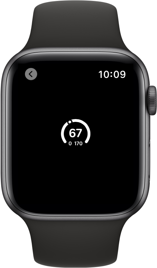
To change the style of a gauge, use the gaugeStyle(_:) view modifier and supply an initializer for a specific gauge style. For example, to display the same gauge in a circular style, apply the circular style to the view:


struct LabeledGauge: View {
    @State private var current = 67.0
    @State private var minValue = 0.0
    @State private var maxValue = 170.0


    var body: some View {
        Gauge(value: current, in: minValue...maxValue) {
            Text("BPM")
        } currentValueLabel: {
            Text("\(Int(current))")
        } minimumValueLabel: {
            Text("\(Int(minValue))")
        } maximumValueLabel: {
            Text("\(Int(maxValue))")
        }
        .gaugeStyle(.circular)
    }
}

A circular gauge describing heart rate in beats per minute with its

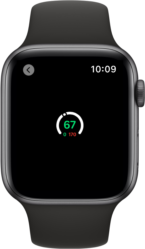
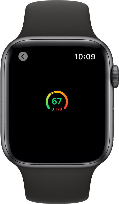
To style elements of a gauge’s presentation, you apply view modifiers to the elements that you want to change. In the example below, the current value, minimum and maximum value labels have custom colors:


struct StyledGauge: View {
    @State private var current = 67.0
    @State private var minValue = 50.0
    @State private var maxValue = 170.0


    var body: some View {
        Gauge(value: current, in: minValue...maxValue) {
            Image(systemName: "heart.fill")
                .foregroundColor(.red)
        } currentValueLabel: {
            Text("\(Int(current))")
                .foregroundColor(Color.green)
        } minimumValueLabel: {
            Text("\(Int(minValue))")
                .foregroundColor(Color.green)
        } maximumValueLabel: {
            Text("\(Int(maxValue))")
                .foregroundColor(Color.red)
        }
        .gaugeStyle(.circular)
    }
}

A circular gauge describing heart rate in beats per minute with its

You can further style a gauge’s appearance by supplying a tint color or a gradient to the style’s initializer. The following example shows the effect of a gradient in the initialization of a CircularGaugeStyle gauge with a colorful gradient across the length of the gauge:


struct StyledGauge: View {
    @State private var current = 67.0
    @State private var minValue = 50.0
    @State private var maxValue = 170.0
    let gradient = Gradient(colors: [.green, .yellow, .orange, .red])


    var body: some View {
        Gauge(value: current, in: minValue...maxValue) {
            Image(systemName: "heart.fill")
                .foregroundColor(.red)
        } currentValueLabel: {
            Text("\(Int(current))")
                .foregroundColor(Color.green)
        } minimumValueLabel: {
            Text("\(Int(minValue))")
                .foregroundColor(Color.green)
        } maximumValueLabel: {
            Text("\(Int(maxValue))")
                .foregroundColor(Color.red)
        }
        .gaugeStyle(CircularGaugeStyle(tint: gradient))
    }
}

A screenshot showing a circular gauge with a gradient

Topics 話題

Creating a Gauge ゲージを作成する

Styling Gauges

Supporting Types 支援を行う型

Default Implementations 省略時実装

Relationships 関係

Conforms To 次に準拠

See Also 参照

Indicators