struct ToggleStyleConfiguration typealias Configurationassociatedtype Body : ViewAvailability 有効性
Technology
func makeBody(configuration: Self.Configuration) -> Self.BodyA view that has behavior and appearance that enables it to function as a Toggle.
configurationThe properties of the toggle, including a label and a binding to the toggle’s state.
Implement this method when you define a custom toggle style that conforms to the Toggle protocol. Use the configuration input — a Toggle instance — to access the toggle’s label and state. Return a view that has the appearance and behavior of a toggle. For example you can create a toggle that displays a label and a circle that’s either empty or filled with a checkmark:
struct ChecklistToggleStyle: ToggleStyle {
    func makeBody(configuration: Configuration) -> some View {
        Button {
            configuration.isOn.toggle()
        } label: {
            HStack {
                Image(systemName: configuration.isOn
                        ? "checkmark.circle.fill"
                        : "circle")
                configuration.label
            }
        }
        .tint(.primary)
        .buttonStyle(.borderless)
    }
}
The Checklist toggle style provides a way to both observe and modify the toggle state: the circle fills for the on state, and users can tap or click the toggle to change the state. By using a customized Button to compose the toggle’s body, SwiftUI automatically provides the behaviors that users expect from a control that has button-like characteristics.
You can present a collection of toggles that use this style in a stack:

When updating a view hierarchy, the system calls your implementation of the make method for each Toggle instance that uses the associated style.
Rather than create an entirely new style, you can alternatively modify a toggle’s current style. Use the init(_:) initializer inside the make method to create and modify a toggle based on a configuration value. For example, you can create a style that adds padding and a red border to the current style:
struct RedBorderToggleStyle: ToggleStyle {
    func makeBody(configuration: Configuration) -> some View {
        Toggle(configuration)
            .padding()
            .border(.red)
    }
}
If you create a red static variable from this style, you can apply the style to toggles that already use another style, like the built-in switch and button styles:
Toggle("Switch", isOn: $isSwitchOn)
    .toggleStyle(.redBorder)
    .toggleStyle(.switch)


Toggle("Button", isOn: $isButtonOn)
    .toggleStyle(.redBorder)
    .toggleStyle(.button)
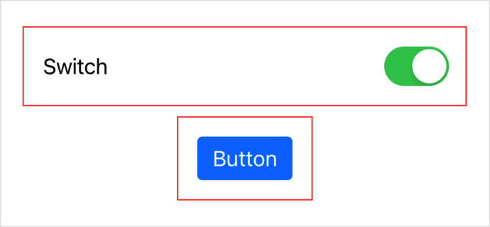
Both toggles appear with the usual styling, each with a red border:

Apply the custom style closer to the toggle than the modified style because SwiftUI evaluates style view modifiers in order from outermost to innermost. If you apply the styles in the other order, the red border style doesn’t have an effect, because the built-in styles override it completely.
struct ToggleStyleConfiguration typealias Configurationassociatedtype Body : View