struct HStackstruct VStackstruct ZStackTechnology
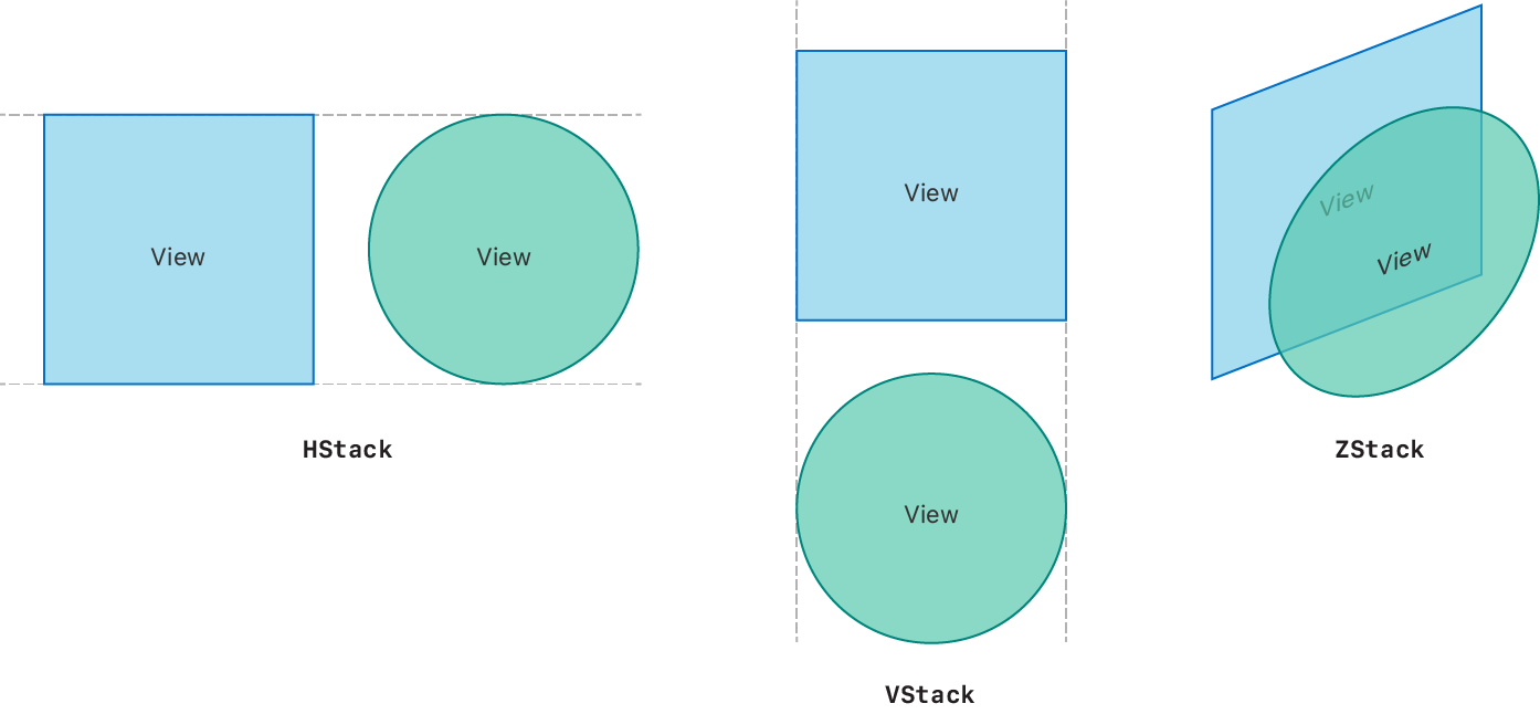
Individually, HStack, VStack, and ZStack are simple views. HStack positions views in a horizontal line, VStack positions them in a vertical line, and ZStack overlays views on top of one another.

When you initialize them with default parameters, stack views center align their content and insert a small amount of spacing between each contained view. But, when you combine and customize stacks with view modifiers, Spacer, and Divider views, you can create highly flexible and complex layouts.
Think about a layout in terms of how you might create it using the various types of stack views as you start to translate your design into code. Break down complex designs into smaller, simpler pieces you can build with stack views.
For example, you might build this profile view using three stack views:

A ZStack contains an Image view that displays a profile picture with a semi-transparent HStack overlaid on top. The HStack contains a VStack with a pair of Text views inside it, and a Spacer view pushes the VStack to the leading side.
To create this stack view:
struct ProfileView: View {
    var body: some View {
        ZStack(alignment: .bottom) {
            Image("ProfilePicture")
                .resizable()
                .aspectRatio(contentMode: .fit)
            HStack {
                VStack(alignment: .leading) {
                    Text("Rachael Chiseck")
                        .font(.headline)
                    Text("Chief Executive Officer")
                        .font(.subheadline)
                }
                Spacer()
            }
            .padding()
            .foregroundColor(.primary)
            .background(Color.primary
                            .colorInvert()
                            .opacity(0.75))
        }
    }
}Align any contained views inside a stack view by using a combination of the alignment property, Spacer, and Divider views.
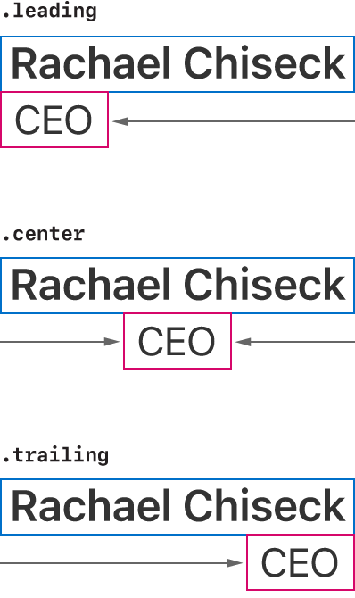
In the previous example layout, the VStack that contains the two Text views uses the leading alignment:

The alignment property doesn’t position the VStack inside its container; instead, it positions the views inside the VStack.
The alignment property of a VStack only applies to the horizontal alignment of the contained controls using Horizontal. Similarly, the alignment property for an HStack only controls the vertical alignment using Vertical. Finally, you can align views inside a ZStack along both axes with Alignment.
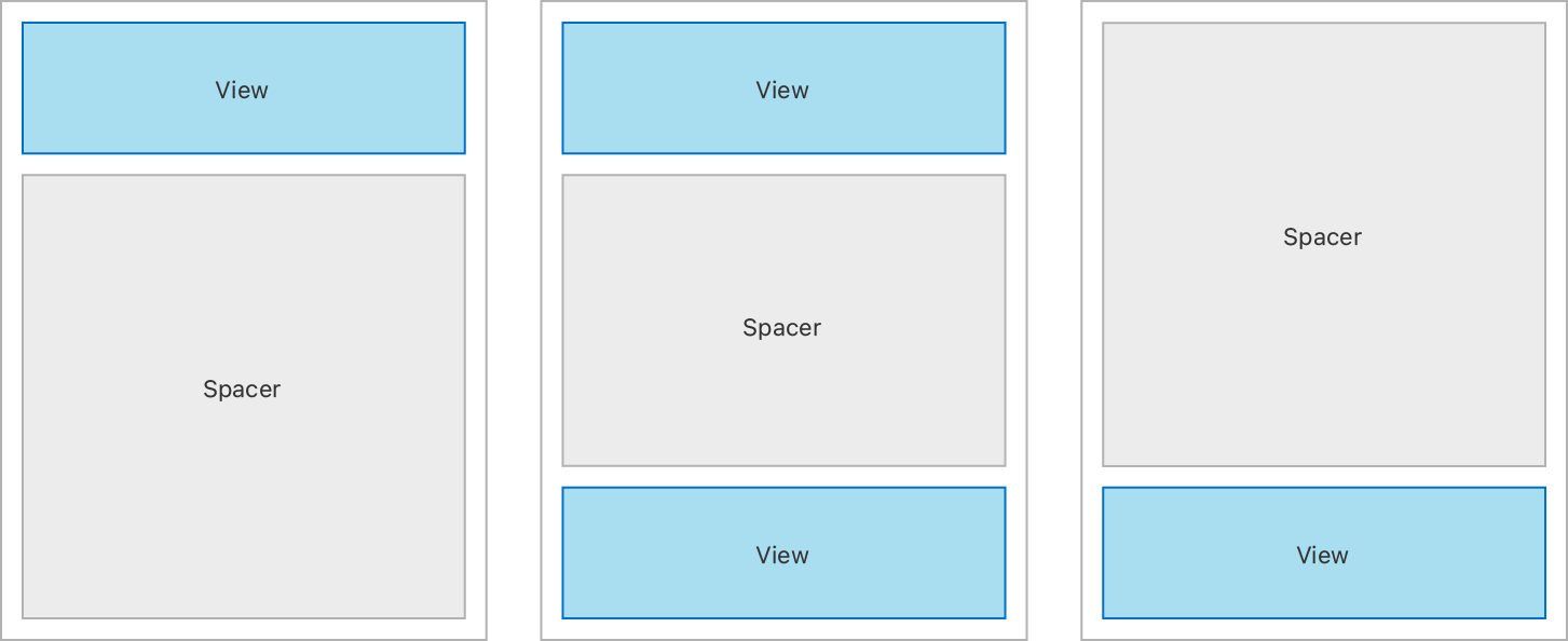
Use Spacer views to align views along the primary axis of an HStack or VStack. Spacers expand to fill any available space and push content apart from other views or the edges of the stack.

Divider views also add space in between a stack’s subviews, but only insert enough space to draw a line across the stack’s minor axis. They don’t expand to fill available space.
Wherever possible, define structure and hierarchy rather than explicitly positioning view frames. Instead of using explicit heights and widths for views, let them expand to fill available space. Adaptive layouts that you build adapt more easily to different device sizes and platforms.
It is possible to create this article’s example layout with two stack views rather than three, by manipulating the Text view frames explicitly. While the output might look the same, the code to implement it is more brittle, and might not scale as well across devices of different size classes.
You may need to make adjustments to a layout that uses explicit adjustments by using view modifiers such as frame(width: or position(x:, but only consider this when you can’t achieve your desired layout in an adaptive, flexible way. For more information on making fine adjustments to view layout, see Making Fine Adjustments to a View’s Position.
In some situations it may make sense to add depth to your layout by using the overlay(_: and background(_: view modifiers instead of a ZStack. The background view modifier places another view behind the view you’re modifying, and overlay places a view on top of it.
Choose between a stack-based approach and the view modifier approach based on how you want to determine the size of the final layout. If your layout has one dominant view that defines the size of the layout, use the overlay(_: or background(_: view modifier on that view. If you want the final view size to come from an aggregation of all the contained views, use a ZStack.
For example, this code overlays a Profile view on top of the Image view:
struct ProfileViewWithOverlay: View {
    var body: some View {
        VStack {
            Image("ProfilePicture")
                .resizable()
                .aspectRatio(contentMode: .fit)
                .overlay(ProfileDetail(), alignment: .bottom)
        }
    }
}


struct ProfileDetail: View {
    var body: some View {
        HStack {
            VStack(alignment: .leading) {
                Text("Rachael Chiseck")
                    .font(.headline)
                Text("Chief Executive Officer")
                    .font(.subheadline)
            }
            Spacer()
        }
        .padding()
        .foregroundColor(.primary)
        .background(Color.primary
                        .colorInvert()
                        .opacity(0.75))
    }
}struct HStackstruct VStackstruct ZStack