The edge of the view to associate the swipe actions with. The default is Horizontal.
swipeActions(edge:allowsFullSwipe:content:)
Availability 有効性
- iOS 15.0+
- iPadOS 15.0+
- macOS 12.0+
- Mac Catalyst 15.0+
- watchOS 8.0+
Technology
- Swift
UI
Declaration 宣言
func swipeActions<T>(edge: HorizontalEdge = .trailing, allowsFullSwipe: Bool = true, content: () -> T) -> some View where T : View
Parameters パラメータ
edgeEdge .trailing allowsFullSwipeA Boolean value that indicates whether a full swipe automatically performs the first action. The default is
true.contentThe content of the swipe actions.
Discussion 議論
Use this method to add swipe actions to a view that acts as a row in a list. Indicate the Horizontal where the swipe action originates, and define individual actions with Button instances. For example, if you have a list of messages, you can add an action to toggle a message as unread on a swipe from the leading edge, and actions to delete or flag messages on a trailing edge swipe:
List {
    ForEach(store.messages) { message in
        MessageCell(message: message)
            .swipeActions(edge: .leading) {
                Button { store.toggleUnread(message) } label: {
                    if message.isUnread {
                        Label("Read", systemImage: "envelope.open")
                    } else {
                        Label("Unread", systemImage: "envelope.badge")
                    }
                }
            }
            .swipeActions(edge: .trailing) {
                Button(role: .destructive) {
                    store.delete(message)
                } label: {
                    Label("Delete", systemImage: "trash")
                }
                Button { store.flag(message) } label: {
                    Label("Flag", systemImage: "flag")
                }
            }
        }
    }
}
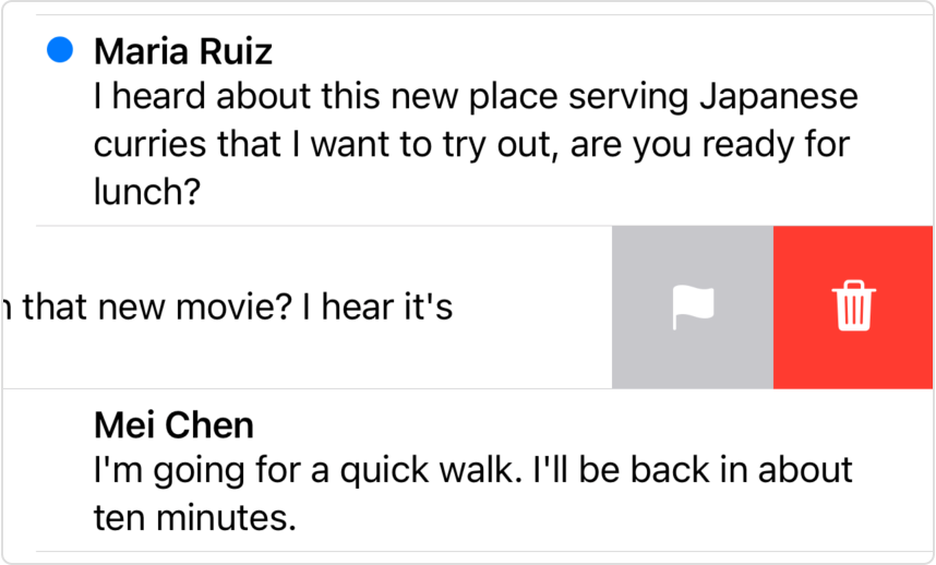
Actions appear in the order you list them, starting from the swipe’s originating edge. In the example above, the Delete action appears closest to the screen’s trailing edge:

For labels or images that appear in swipe actions, SwiftUI automatically applies the fill symbol variant, as shown above.
By default, the user can perform the first action for a given swipe direction with a full swipe. For the example above, the user can perform both the toggle unread and delete actions with full swipes. You can opt out of this behavior for an edge by setting the allows parameter to false. For example, you can disable the full swipe on the leading edge:
.swipeActions(edge: .leading, allowsFullSwipe: false) {
    Button { store.toggleUnread(message) } label: {
        if message.isUnread {
            Label("Read", systemImage: "envelope.open")
        } else {
            Label("Unread", systemImage: "envelope.badge")
        }
    }
}
When you set a role for a button using one of the values from the Button enumeration, SwiftUI styles the button according to its role. In the example above, the delete action appears in red because it has the destructive role. If you want to set a different color — for example, to match the overall theme of your app’s UI — add the tint(_:) modifier to the button:
MessageCell(message: message)
    .swipeActions(edge: .leading) {
        Button { store.toggleUnread(message) } label: {
            if message.isUnread {
                Label("Read", systemImage: "envelope.open")
            } else {
                Label("Unread", systemImage: "envelope.badge")
            }
        }
        .tint(.blue)
    }
    .swipeActions(edge: .trailing) {
        Button(role: .destructive) { store.delete(message) } label: {
            Label("Delete", systemImage: "trash")
        }
        Button { store.flag(message) } label: {
            Label("Flag", systemImage: "flag")
        }
        .tint(.orange)
    }
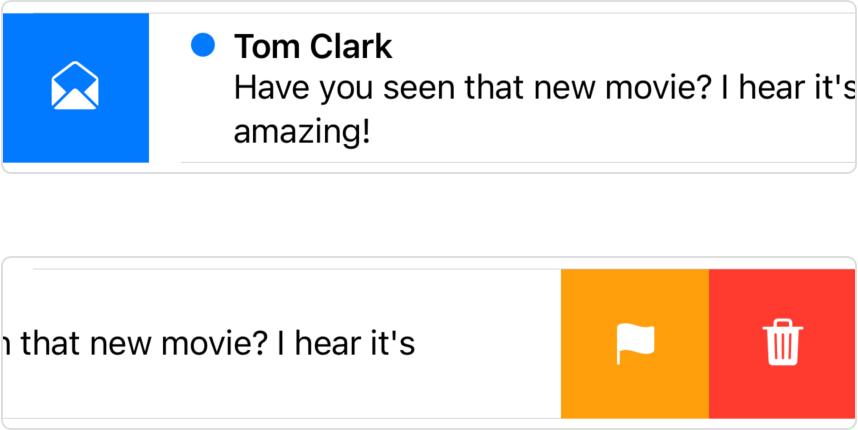
The modifications in the code above make the toggle unread action blue and the flag action orange:

When you add swipe actions, SwiftUI no longer synthesizes the Delete actions that otherwise appear when using the on method on a For instance. You become responsible for creating a Delete action, if appropriate, among your swipe actions.
Actions accumulate for a given edge if you call the modifier multiple times on the same list row view.