Return Value 戻り値
A view that uses the specified content as a foreground.
Availability 有効性
Technology
A view that uses the specified content as a foreground.
alignmentcontentA View that you use to declare the views to draw in front of this view, stacked in the order that you list them. The last view that you list appears at the front of the stack.
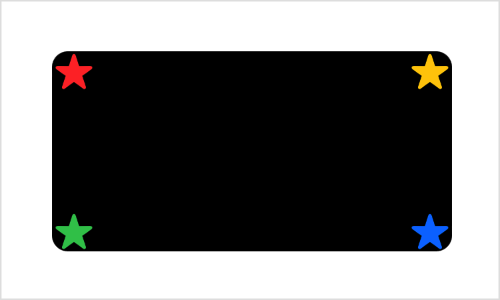
Use this modifier to place one or more views in front of another view. For example, you can place a group of stars on a Rounded:
RoundedRectangle(cornerRadius: 8)
    .frame(width: 200, height: 100)
    .overlay(alignment: .topLeading) { Star(color: .red) }
    .overlay(alignment: .topTrailing) { Star(color: .yellow) }
    .overlay(alignment: .bottomLeading) { Star(color: .green) }
    .overlay(alignment: .bottomTrailing) { Star(color: .blue) }
The example above assumes that you’ve defined a Star view with a parameterized color:
struct Star: View {
    var color = Color.yellow


    var body: some View {
        Image(systemName: "star.fill")
            .foregroundStyle(color)
    }
}
By setting different alignment values for each modifier, you make the stars appear in different places on the rectangle:

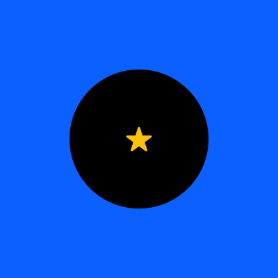
If you specify more than one view in the content closure, the modifier collects all of the views in the closure into an implicit ZStack, taking them in order from back to front. For example, you can place a star and a Circle on a field of blue:
Color.blue
    .frame(width: 200, height: 200)
    .overlay {
        Circle()
            .frame(width: 100, height: 100)
        Star()
    }
Both the overlay modifier and the implicit ZStack composed from the overlay content — the circle and the star — use a default center alignment. The star appears centered on the circle, and both appear as a composite view centered in front of the square:

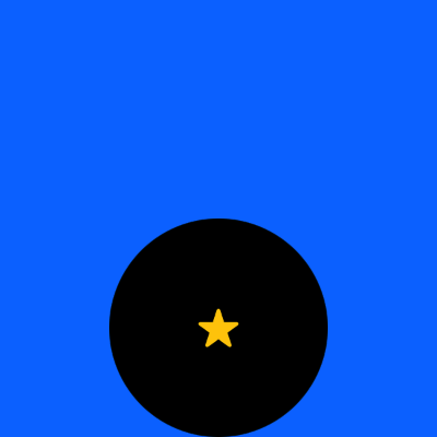
If you specify an alignment for the overlay, it applies to the implicit stack rather than to the individual views in the closure. You can see this if you add the bottom alignment:
Color.blue
    .frame(width: 200, height: 200)
    .overlay(alignment: .bottom) {
        Circle()
            .frame(width: 100, height: 100)
        Star()
    }
The circle and the star move down as a unit to align the stack’s bottom edge with the bottom edge of the square, while the star remains centered on the circle:

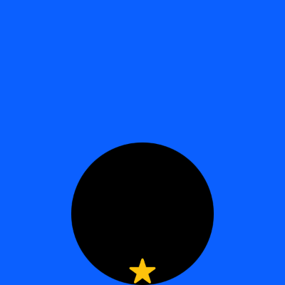
To control the placement of individual items inside the content closure, either use a different overlay modifier for each item, as the earlier example of stars in the corners of a rectangle demonstrates, or add an explicit ZStack inside the content closure with its own alignment:
Color.blue
    .frame(width: 200, height: 200)
    .overlay(alignment: .bottom) {
        ZStack(alignment: .bottom) {
            Circle()
                .frame(width: 100, height: 100)
            Star()
        }
    }
The stack alignment ensures that the star’s bottom edge aligns with the circle’s, while the overlay aligns the composite view with the square:

You can achieve layering without an overlay modifier by putting both the modified view and the overlay content into a ZStack. This can produce a simpler view hierarchy, but changes the layout priority that SwiftUI applies to the views. Use the overlay modifier when you want the modified view to dominate the layout.
If you want to specify a Shape like a Color or a Material as the overlay, use overlay(_: instead. To specify a Shape, use overlay(_:.