struct Liststruct ListItemTint struct Sectionstruct ForEach protocol DynamicViewContent Technology
Displaying a collection of data in a vertical list is a common requirement in many apps. Whether it’s a list of contacts, a schedule of events, an index of categories, or a shopping list, you’ll often find a use for a List.
List views display collections of items vertically, load rows as needed, and add scrolling when the rows don’t fit on the screen, making them suitable for displaying large collections of data.
By default, list views also apply platform-appropriate styling to their elements. For example, on iOS, the default configuration of a list displays a separator line between each row, and adds disclosure indicators next to items that initiate navigation actions.
Note 注意
If you want to remove the platform-appropriate styling — such as row separators or automatic disclosure indicators — from your list, consider using Lazy instead. For more information on working with lazy stacks, see Creating Performant Scrollable Stacks
The code in this article shows the use of list views to display a company’s staff directory. Each section enhances the usefulness of the list, by adding custom cells, splitting the list into sections, and using the list selection to navigate to a detail view.
The most common use of List is for representing collections of information in your data model. The following example defines a Person as an Identifiable type with the properties name and phone. An array called staff contains two instances of this type.
struct Person: Identifiable {
     let id = UUID()
     var name: String
     var phoneNumber: String
 }


var staff = [
    Person(name: "Juan Chavez", phoneNumber: "(408) 555-4301"),
    Person(name: "Mei Chen", phoneNumber: "(919) 555-2481")
]
To present the contents of the array as a list, the example creates a List instance. The list’s content builder uses a For to iterate over the staff array. For each member of the array, the listing creates a row view by instantiating a new Text that contains the name of the Person.
struct StaffList: View {
    var body: some View {
        List {
            ForEach(staff) { person in
                Text(person.name)
            }
        }
    }
}
Members of a list must be uniquely identifiable from one another. Unique identifiers allow SwiftUI to automatically generate animations for changes in the underlying data, like inserts, deletions, and moves. Identify list members either by using a type that conforms to Identifiable, as Person does, or by providing an id parameter with the key path to a unique property of the type. The For that populates the list above depends on this behavior, as do the List initializers that take a Random of members to iterate over.
Important 重要
The values you use for Identifiable data must be unique. Using a UUID or a database row identifier are both good choices, whereas using data like a person’s name or phone number could potentially contain duplicates.
Each row inside a List must be a SwiftUI View. You may be able to represent your data with a single view such as an Image or Text view, or you may need to define a custom view to compose several views into something more complex.
As your row views get more sophisticated, refactor the views into separate view structures, passing in the data that the row needs to render. The following example defines a Person to create a two-line view for a Person, using fonts, colors, and the system “phone” icon image to visually style the data.
struct PersonRowView: View {
    var person: Person


    var body: some View {
        VStack(alignment: .leading, spacing: 3) {
            Text(person.name)
                .foregroundColor(.primary)
                .font(.headline)
            HStack(spacing: 3) {
                Label(person.phoneNumber, systemImage: "phone")
            }
            .foregroundColor(.secondary)
            .font(.subheadline)
        }
    }
}


struct StaffList: View {
    var body: some View {
        List {
            ForEach(staff) { person in
                PersonRowView(person: person)
            }
        }
    }
}
For more information on composing the types of views commonly used inside list rows, see Building Layouts with Stack Views.
List views can also display data with a level of hierarchy, grouping associated data into sections.
Consider an expanded data model that represents an entire company, including multiple departments. Each Department has a name and an array of Person instances, and the company has an array of the Department type.
struct Department: Identifiable {
    let id = UUID()
    var name: String
    var staff: [Person]
}


struct Company {
    var departments: [Department]
}


var company = Company(departments: [
    Department(name: "Sales", staff: [
        Person(name: "Juan Chavez", phoneNumber: "(408) 555-4301"),
        Person(name: "Mei Chen", phoneNumber: "(919) 555-2481"),
        // ...
    ]),
    Department(name: "Engineering", staff: [
        Person(name: "Bill James", phoneNumber: "(408) 555-4450"),
        Person(name: "Anne Johnson", phoneNumber: "(417) 555-9311"),
        // ...
    ]),
    // ...
])
Use Section views to give the data inside a List a level of hierarchy. Start by creating the List, using a For to iterate over the company array, and then create Section views for each department. Within the section’s view builder, use a For to iterate over the department’s staff, and return a customized view for each Person.
List {
     ForEach(company.departments) { department in
         Section(header: Text(department.name)) {
             ForEach(department.staff) { person in
                PersonRowView(person: person)
             }
         }
     }
 }
Note 注意
If your data hierarchy is too deep to represent with a single level of sections and rows, Outline and Disclosure might be a better fit. These views use a disclosure metaphor to allow the user to drill down to an arbitrary depth in the hierarchy.
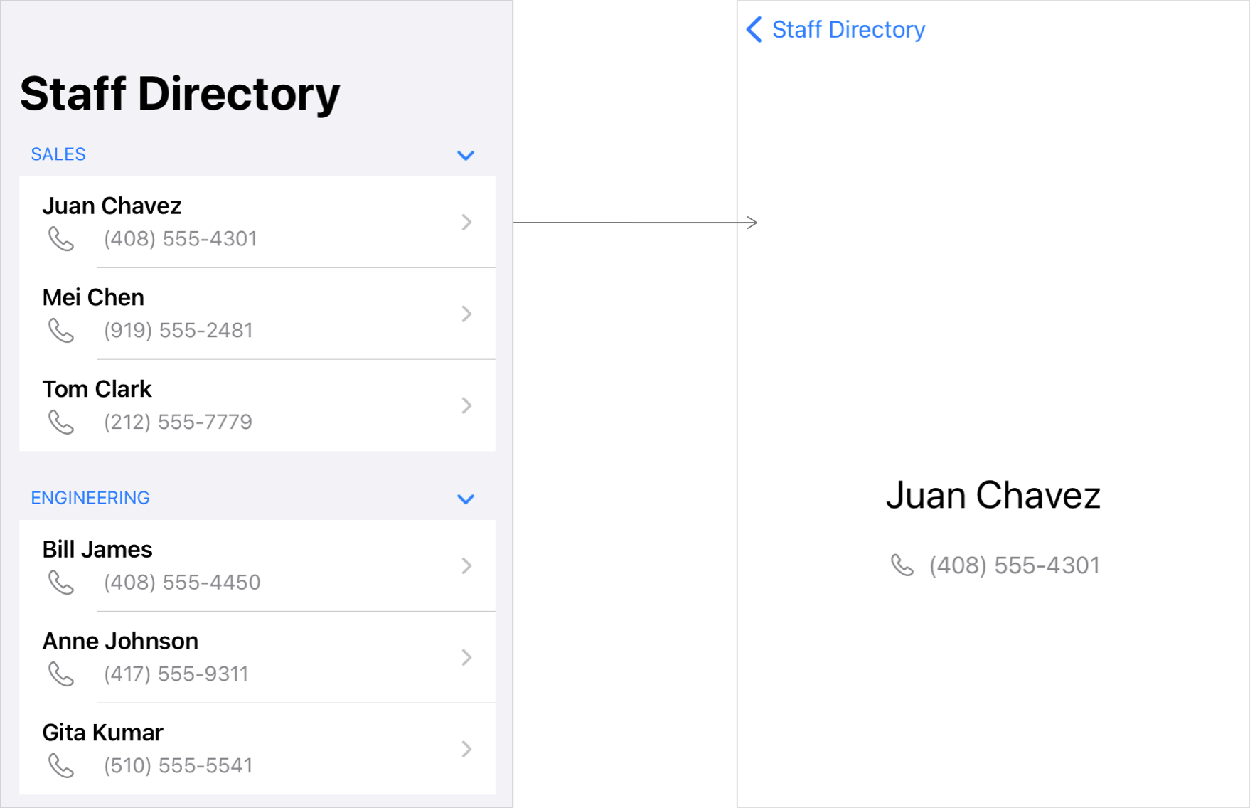
Using a Navigation within a List contained inside a Navigation adds platform-appropriate visual styling, and in some cases, additional container views that provide the structure for navigation. SwiftUI uses one of two visual presentations, based on the runtime environment:
A list with disclosure indicators, which performs an animated navigation to a destination scene when the user chooses a list item. SwiftUI uses this presentation on watchOS, tvOS, and on most iOS devices except as described below.
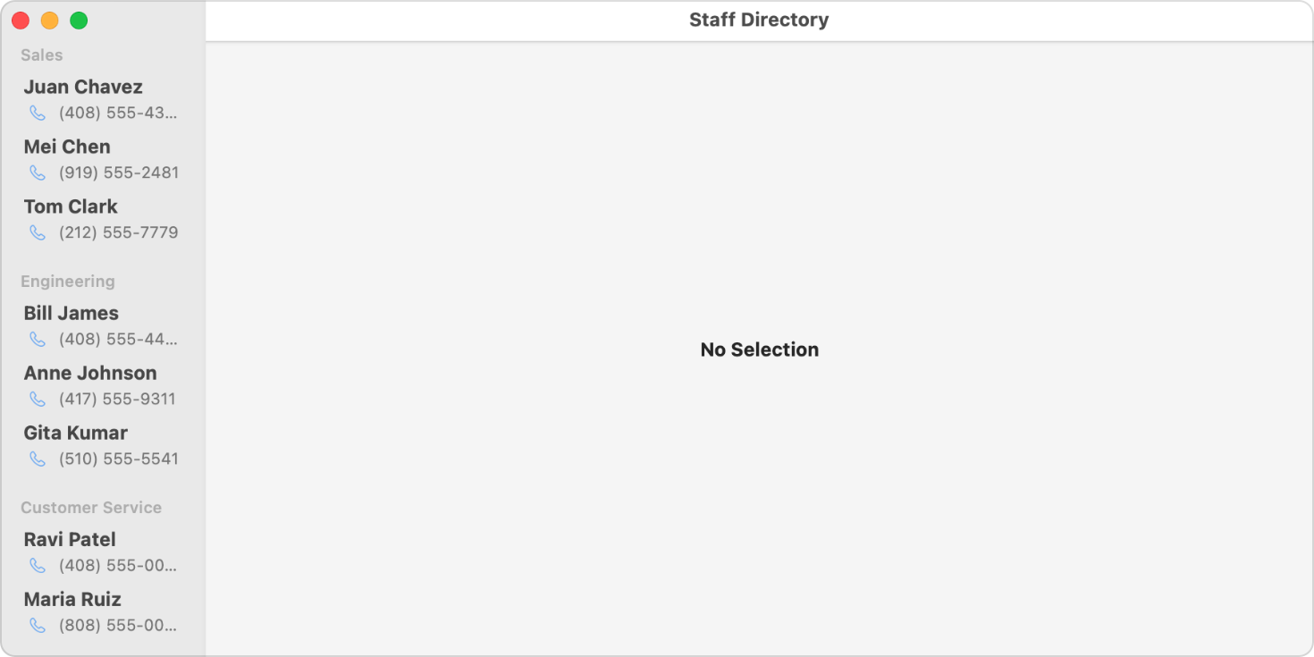
A two-panel split view, with the top-level data as a list on the left side and the detail on the right. To get this presentation, you also need to provide a placeholder view after the list; this placeholder fills the detail pane until the user makes a selection. SwiftUI uses this two-panel approach on macOS, iPadOS, and on iOS devices with sufficient horizontal space, as indicated by the horizontal environment value.
The following example sets up a navigation-based UI by wrapping the list with a navigation view. Instances of Navigation wrap the list’s rows to provide a destination view to navigate to when the user taps the row. If a split view navigation is appropriate for the platform, the right panel initially contains the “No Selection” placeholder view, which the navigation view replaces with the destination view when the user makes a selection.
NavigationView {
    List {
        ForEach(company.departments) { department in
            Section(header: Text(department.name)) {
                ForEach(department.staff) { person in
                    NavigationLink(destination: PersonDetailView(person: person)) {
                        PersonRowView(person: person)
                    }
                }
            }
        }
    }
    .navigationTitle("Staff Directory")


    // Placeholder
    Text("No Selection")
        .font(.headline)
}
In this example, the view passed in as the destination is a Person, which repeats the information from the list. In a more complex app, this detail view could show more information about a Person than would fit inside the list row.
struct PersonDetailView: View {
    var person: Person


    var body: some View {
        VStack {
            Text(person.name)
                .foregroundColor(.primary)
                .font(.title)
                .padding()
            HStack {
                Label(person.phoneNumber, systemImage: "phone")
            }
            .foregroundColor(.secondary)
        }
    }
}
On most iOS devices (those with a compact horizontal size class), the list appears as a view by itself, and tapping a row performs an animated transition to the destination view. The following figure shows both the list view and the destination view that appears when the user makes a selection:

On the other hand, iPadOS and macOS show the list and the detail view together as a multi-column view. The following figure shows what this example looks like on macOS prior to making a selection, which means the “No selection” placeholder view is still in the detail column.

You can use the navigation view modifier to change the default behavior of a Navigation. For example, on iOS, the Stack forces single-column mode, even on an iPad in landscape orientation.
struct Liststruct ListItemTint struct Sectionstruct ForEach protocol DynamicViewContent