Overview 概要
SwiftUI provides a range of container views that group and repeat views. Use some containers purely for structure and layout, like stack views, lazy stack views, and grid views. Use others, like lists and forms, to also adopt system-standard visuals and interactivity.
Choosing the most appropriate container views for each part of your app’s user interface is an important skill to learn; it helps you with everything from positioning two views next to each other, to creating complex layouts with hundreds of elements.
Group Collections of Views
Stack views are the most primitive layout container available in SwiftUI. Use stacks to group collections of views into horizontal or vertical lines, or to stack them on top of one another.
Use HStack to lay out views in a horizontal line, VStack to position views in a vertical line, and ZStack to layer views on top of one another. Then, combine stack views to compose more complex layouts. These three kinds of stacks, along with their alignment and spacing properties, view modifiers, and Spacer views combine to allow extensive layout flexibility.

You often use stack views as building blocks inside other container views. For example, a List typically contains stack views, with which you lay out views inside each row.
For more information on using stack views to lay out views, see Building Layouts with Stack Views.
Repeat Views or Groups of Views
You can also use HStack, VStack, Lazy, and Lazy to repeat views or groups of views. Place a stack view inside a Scroll so your content can expand beyond the bounds of its container. Users can simultaneously scroll horizontally, vertically, or in both directions.
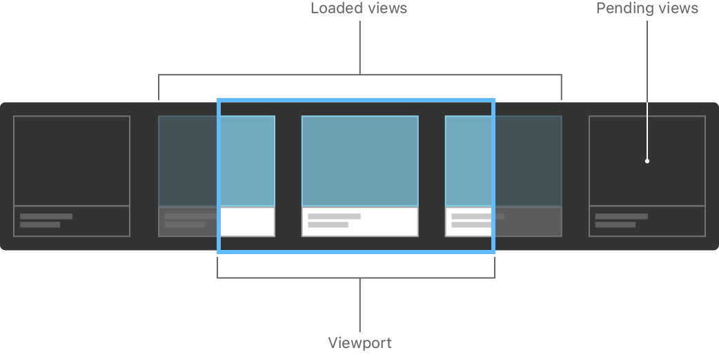
Stack views and lazy stacks have similar functionality, and they may feel interchangeable, but they each have strengths in different situations. Stack views load their child views all at once, making layout fast and reliable, because the system knows the size and shape of every subview as it loads them. Lazy stacks trade some degree of layout correctness for performance, because the system only calculates the geometry for subviews as they become visible.

When choosing the type of stack view to use, always start with a standard stack view and only switch to a lazy stack if profiling your code shows a worthwhile performance improvement. For more information on lazy stack views and how to measure your app’s view loading performance, see Creating Performant Scrollable Stacks.
Position Views in a Two-Dimensional Layout
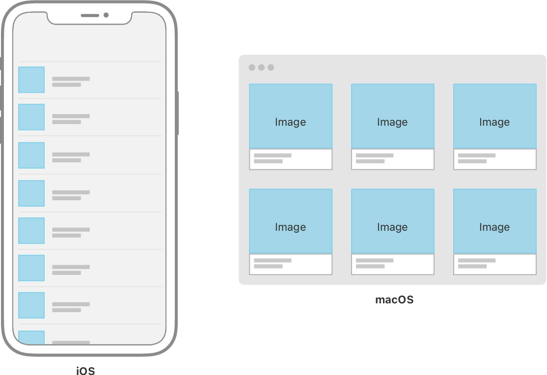
To lay out views horizontally and vertically at the same time, use a Lazy or Lazy. Grids are a good container choice to lay out content that naturally displays in square containers, like an image gallery. Grids are also a good choice to scale user interface layouts up for display on larger devices. For example, a directory of contact information might suit a list or vertical stack on an iPhone, but might fit more naturally in a grid layout when scaled up to a larger device like the iPad or Mac.

Like stack views, SwiftUI grid views don’t inherently include a scrolling viewport; place them inside a Scroll if the content might be larger than the available space.
Display and Interact with Collections of Data
List views in SwiftUI are conceptually similar to the combination of a Lazy and Scroll, but by default will include platform-appropriate visual styling around and between their contained items. For example, when running on iOS, the default configuration of a List adds separator lines between rows, and draws disclosure indicators for items which have navigation, and where the list is contained in a Navigation.
List views also support platform-appropriate interactivity for common tasks such as inserting, reordering, and removing items. For example, adding the on modifier to a For inside a List will enable system-standard swipe-to-delete interactivity.
Like Lazy and Lazy, rows inside a SwiftUI List also load lazily, and there is no non-lazy equivalent. Lists inherently scroll when necessary, and you don’t need to wrap them in a Scroll.
Group Views and Controls for Data Entry
Use Form to build data-entry interfaces, settings, or preference screens that use system-standard controls.

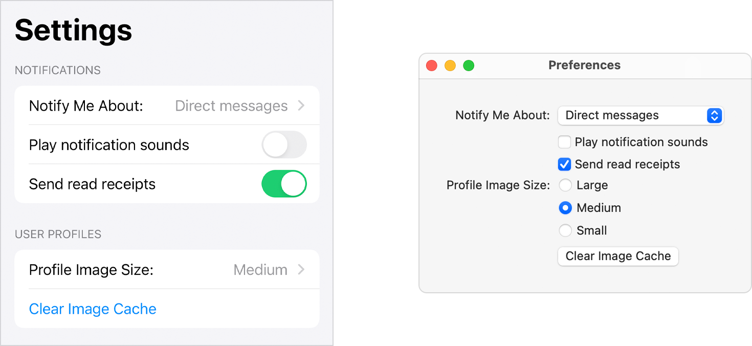
Like all SwiftUI views, forms display their content in a platform-appropriate way. Be aware that the layout of controls inside a Form may differ significantly based on the platform. For example, a Picker control in a Form on iOS adds navigation, showing the picker’s choices on a separate screen, while the same Picker on macOS displays a pop-up button or set of radio buttons.